Friday, March 09, 2007
Templates, Smemplates!
Guys, now that we are on the much improved beta blogger (NOT!), I can do all sorts of funky things with the template. I did try the other day, but for some reason I couldn't get the colors to change and it came out black and white. So I switched back to the classic template. Now I can just stay with this template and play around with it or do the beta thing or leave well enough alone. Any thoughts?
Subscribe to:
Post Comments (Atom)
12 comments:
it took me a long while to get used to this look and at first i didn't like it BUT i kinda do now. However, i am always up for change IF it is everyones choice. is it possible to drop in some artwork as i did with 'music to grow old to'?
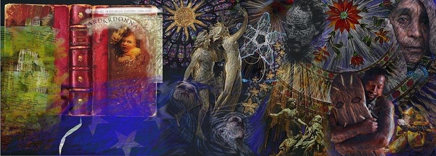
maybe get one of our arty types to create something unique?
I actually would like that. I am not sure how to do that. I have played around with fonts and the like, but what would be needed is a photo of which I could make a skin. If someone else is better, I am happy to give them administrator rights (VG, calling you--you already are one!) and let them do it. I am open to anything. I know this template isn't ideal, but I don't want a loud one as I've seen on some others. But it would be nice to see one that represents our diversity in our approach as we (I hope we have this rep) are NOT judgmental; we welcome all kinds of expression and we are not snobs. Many people here do things that I cannot, but I enjoy seeing their work.
i totaly agree. something that shows what we and the site are about. i have done it BUT not sure i could do it again. i would have a go if we can get a good enough piece of art.
I'd say get rid of the baby blue. black or white so it doesn't distract so much.
- Peter
Okay, blue goodbye. I will try what I almost did and see how it pans out. It may be black and white text--blogger is hard on us group blogs, but I can put a cool header on as well. By all means, let me know.
how about something like this: http://stacieberyl.blogspot.com/
except i'd want to flip the edges. have grey fill the middle. and black on the outer edges. ignore the content, i'm just referring to the background. you could lay the elements out however. although i prefer the 2 column approach.
I will check it out. I prefered the one column only because of the photography.
I can't get into that blog--invitation only. But keep on suggesting!
oh sorry. me being me i had forgotten others couldn't view it. should work now.
i really don't see a problem with photos in a two colum layout so long as the width of the overall page is ample.
with a one colum all the nagivation and author informaation is virtually hidden.
i think it is taking shape nicely.aside from the look of the site there is certainly a feel here of 'something happening'.
i think what with some of the oldies and the more recent joining of folks like ruksak, alcoholic poet, peter ciccariello, bloodlessness has a tight focus, albeit in very eclectic way, that is giving out some really good stuff.
I will keep working on it in my spare time. I may switch the template--actually I am thinking along those lines. I'm all for keeping the white background--black is too distracting and I will try for a different header. I keep looking for new people to join. All of you--if you know someone who either wants to join or you think should do so, let CJ or me know.
Post a Comment